Data Literacy for Product Management: Causal models and variations.
How many controllable inputs do you know about your product right now? Something like “10% increase in detail page views where the products were in stock and immediately ready for two-day shipping directly improves conversation rates by 1%” - Example from Amazon usecase.
If the answer is none, this article is for you.
Why become Data-Driven?
Data embodies knowledge, and from this knowledge, you can construct a causal model of your product or business. Understanding your controllable inputs and their effects on your outcomes allows for:
Reduced team interruptions, thanks to a better understanding of the variations within your metrics.
Easier “trial and error” processes, as you can always complete the feedback loop by studying the changes to your data, following the Plan-Do-Study-Act cycle.
Understanding Goodhart’s Law
Goodhart’s Law cautions us that focusing solely on altering specific metrics, such as customer complaints or conversion rates, without a deep understanding of your business’s cause-and-effect model can lead to counterproductive behaviors. This means that if teams are pressured to meet targets, they might manipulate the system or data instead of genuinely improving underlying processes.
Goodhart’s Law indicates three potential paths when individuals aim to achieve a set target:
- Genuinely improving the system to enhance overall performance.
- Distorting the system to meet goals without real improvement.
- Manipulating how outcomes are measured to falsely suggest success.
Moreover, Goodhart emphasized the importance of differentiating between the Voice of the Process (how your process actually operates) and the Voice of the Customer (the targets and requirements).
Improving the System
View your product or service as a system of various inputs and outputs. For instance, if your goal is to decrease the number of customer complaints (an output), you must identify which specific inputs can effectively lead to this desired outcome. This involves gaining a deeper insight into how each input affects customer satisfaction and pinpointing areas for improvement.
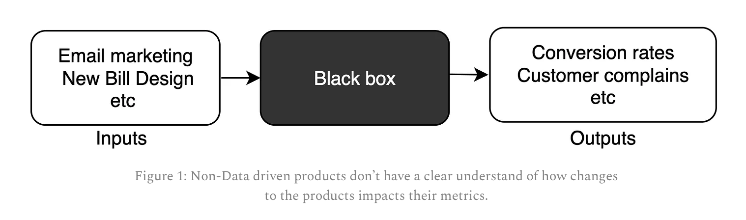
Understanding the Causal Model
Often referred to colloquially as a “black box,” the causal model of your system helps us determine if specific actions lead to desired results.
Leveraging Process Behavior Charts (PBCs)
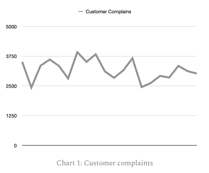
When looking at the raw data of a customer complaints chart, such as the one provided, it’s easy to see the fluctuations in numbers but difficult to extract actionable insights without further analysis. This chart alone, devoid of analytical tools or context, is merely a superficial representation of data. It doesn’t allow for an understanding of underlying patterns, trends, or root causes of the fluctuations in complaint numbers. Without deploying statistical tools or process behavior charts, any hypothesis about why complaints are rising or falling would be based on conjecture rather than evidence.
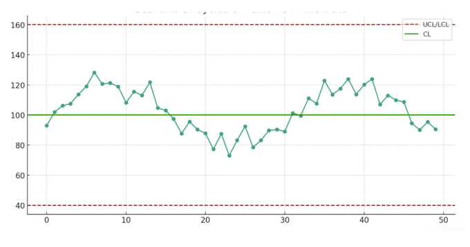
To make sense of your customer complaint data, we turn to Process Behavior Charts (PBCs), particularly the XmR (Shewhart’s Control Chart), which is notably effective. It consists of:
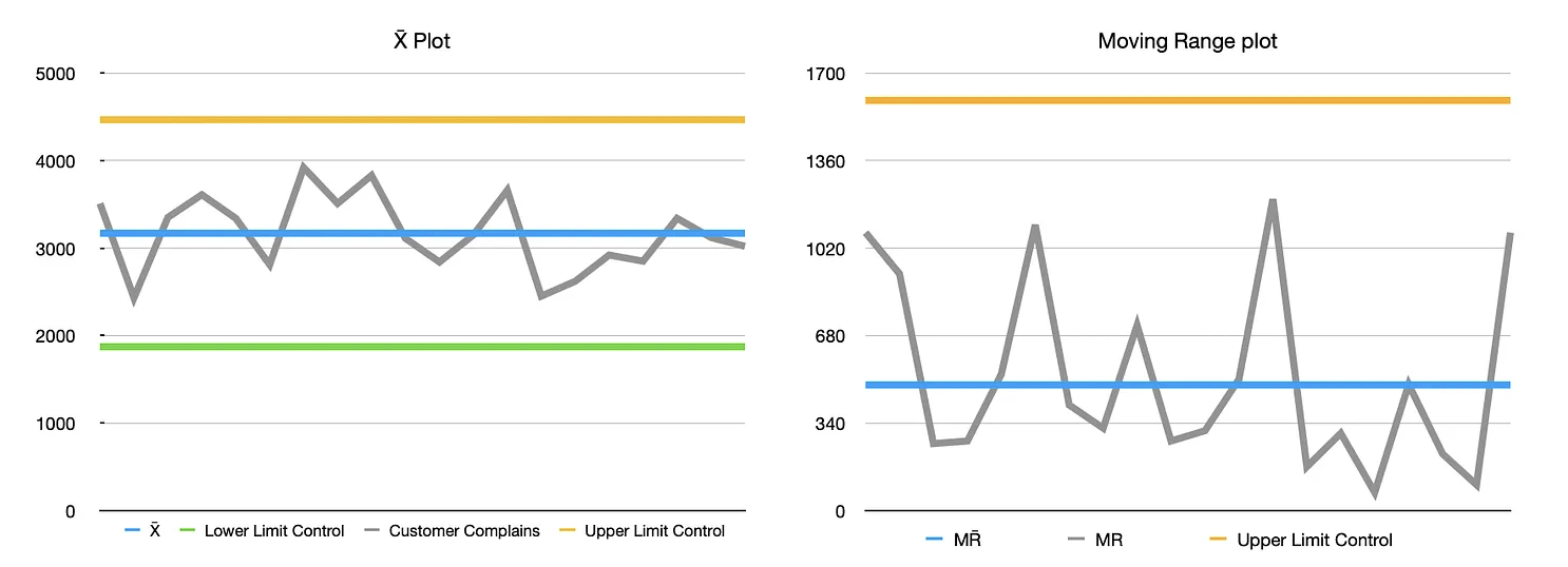
the ‘X-Bar’ chart
In very simple terms, it’s a chart that tracks how the average (or “mean”) of something changes over time. Imagine you’re making cookies and you want all of them to be roughly the same size. Each day you bake a batch, you measure the size of a few cookies and calculate the average size. You then plot this average size on the chart for each batch you make. Over time, this chart will show you if your cookies are getting bigger, smaller, or staying about the same size on average. This helps you understand if your cookie-making process is consistent or if you need to make adjustments to keep the cookie sizes just right.
Moving range chart
A “moving range” chart is another tool used in quality control, focusing on how much something changes from one measurement to the next. Let’s go back to the cookie example. Instead of looking at the average size of cookies in each batch, this time you pay attention to how much the size of the cookies changes from one cookie to the next. After measuring two consecutive cookies, you calculate the difference in their sizes (how much bigger or smaller the second cookie is compared to the first one). You do this for every pair of cookies in the batch and then plot these differences on the chart over time.
Reading the Charts
Status of our Process
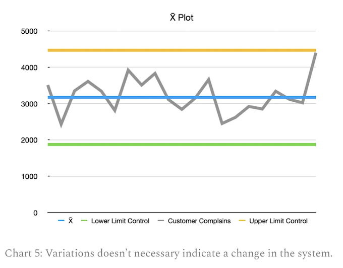
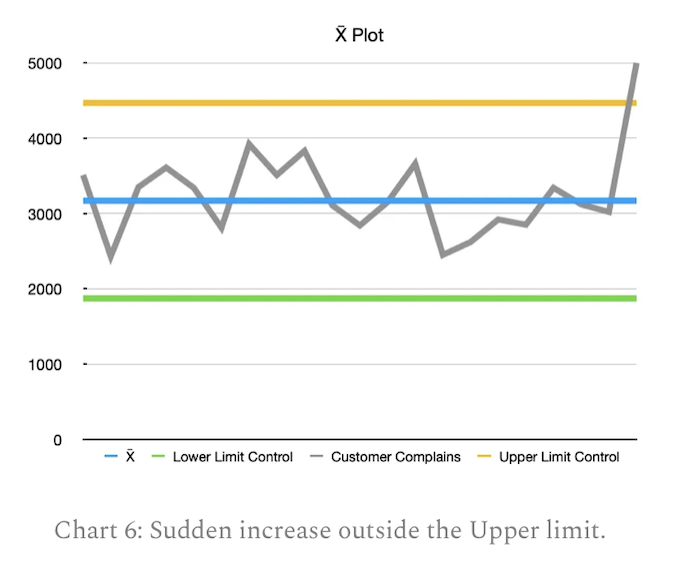
Control charts provide immediate visual feedback on whether a process is stable (in control) or if there are signs of instability (out of control). Chart 3 and 4 tell us that the customer complains for this service is completely predictable, and will fluctuate between 4467 and 1871 assuming nothing fundamentally changes with the process. As seen in Chart 5 below, if tomorrow you see an increase of complaints to 4400 you don’t need to panic as it’s still blew the upper limit Control.
Points Outside Control Limits
They also help us distinguish between common cause variability (inherent to the process) and special cause variability (resulting from specific, identifiable sources). For example, the sudden point outside the upper or lower limits. This requires team to investigate (it could be related to certain outage at that time).
Run of Points on One Side of the Center Line

Run of seven or more consecutive points on one side of the center line (mean) indicates a shift in the process. This doesn’t necessarily mean the process is producing defects, but it does suggest the process average has shifted and is no longer stable.
Cycles or Patterns in the Data
When the data shows a repeating pattern or cycle, this indicates that the process being influenced by systematic factors. These could be related to maintenance schedules, shifts in worker teams, or other cyclical factors.
Trial and Error
Now, it’s time to put theory into practice. Collaborate with your product leads and functions to hypothesize which inputs you control and the outputs they impact. Begin the “trial and error” cycle to test your hypotheses, ensuring you close the “Plan-Do-Study-Act” loop.
Conclusion
Becoming data-driven is not merely a trend but a foundational shift in how we approach product development and business strategy. By understanding the controllable inputs of your product and how they directly influence key outcomes, businesses can make informed decisions that lead to tangible improvements in customer satisfaction and overall performance. The use of Process Behavior Charts (PBCs), such as the XmR charts discussed, provides a powerful tool for visualizing the stability of processes and identifying areas for improvement. Through these methods, we can discern between common cause variability and special cause variability, allowing for more precise interventions. Moreover, adhering to principles that avoid the pitfalls of Goodhart’s Law ensures that our efforts to improve metrics do not lead to counterproductive behaviors or manipulated outcomes. In essence, the journey towards becoming data-driven is about cultivating a deeper understanding of your business’s causal model, enabling a proactive, rather than reactive, approach to management and improvement. By embracing this mindset, organizations can foster a culture of continuous improvement, reduce inefficiencies, and enhance customer satisfaction, ultimately driving success in an increasingly competitive landscape.